
For my last project, I’ve been painstakingly positioning elements on a page, using margins, absolute and relative position to move things back and forth.
As I progress in my CSS journey, along comes the flexbox and halleluja it looks like the answers to my positioning prayers! However, there are A LOT of different properties that we can use and do not want to confuse.
So here is an overview to remind myself, and maybe help others, to remember and make sense of it all. In this first part I’ll focus on how to use flexbox to position things left, right, up, down and all that good stuff. I’ll create a separate post of resizing stuff for different screen sizes.
Flex Container and Flex Items
You can define any element as the flex container with display: flex;
That means the element becomes our box, and all the children are the items in the box that we can move around with properties set on flex container or flex item level.
I start off by creating a container that holds 4 different boxes. Without any flex-boxing added to it, it looks like this:
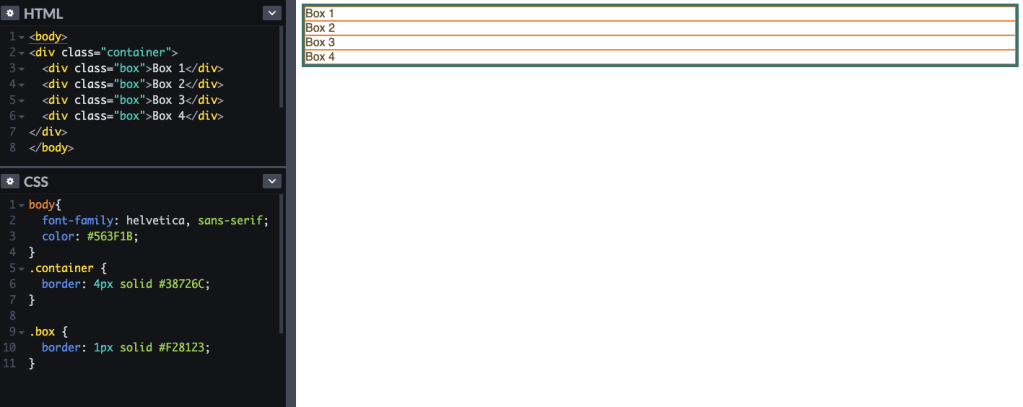
We want to use flex box to position the boxes within the container how we want them.
So the first thing is to define the container as our flex box that holds our items, so we add display: flex; to our container.
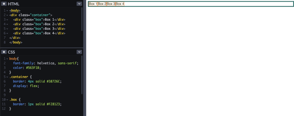
Now the boxes all line up nicely within the container. Let’s add some sizes so we are better able to see what is going on. In the below, I defined the height of the container at 120px, and the size of each box as 100px width and 100px height. I gave them a 2px margin and also changed the box to have an orange background instead of an orange border, so we can see better.
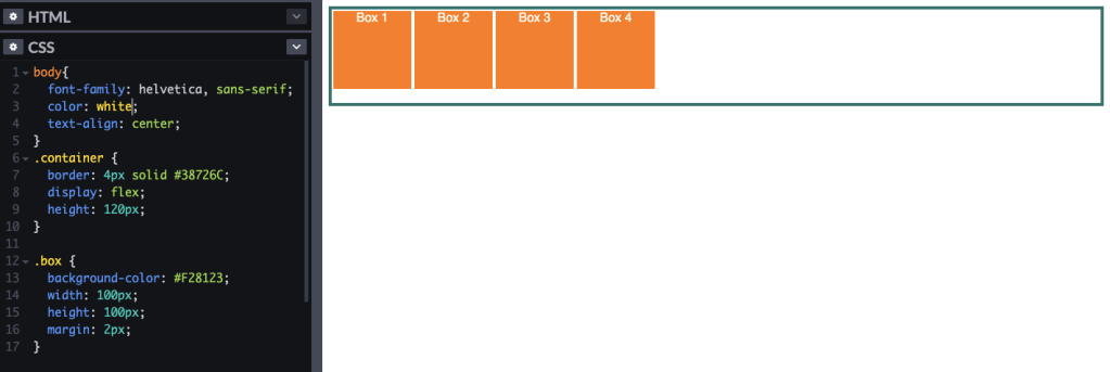
Alright, so that’s our basic set up of the flex-box and its items.
Note: if we wanted to have multiple flex containers in the same line we would use display: inline-flex;
Moving stuff around horizontally with justify-content
Now, if we want to move the boxes around within their container we can use the property justify-content instead of trying to work it all out with margins and alignments.
Here are all the values we can use with justify-content:
justify-content: flex-start; //will align all the items on the left of the container (this is the default)
justify-content: flex-end; //will align all the items on the right of the container
justify-content: flex-center; //will align all the items in the center of the container
justify-content: space-around; //will space the items out evenly in the container with the same spaces to the left and the right of it.
justify-content: space-between; //will also space the items out evenly, with the different that the left and right are aligned with the edge of the container>
The justify-content is set on the container-level and it’ll be applied to all the items in the container. Here is how our boxes move around with the different values:
justify-content: flex-start;

justify-content: flex-end;

justify-content: flex-center;

justify-content: space-around;

justify-content: space-between;

Moving stuff around vertically with align-items
Now that we’ve spaced out our content along the width of the container, let’s do the same aligning it vertically, i.e. moving it up and down. We can do this with the following align-items values:
align-items: flex-start; // aligns items at the top of the container (this is the default)
align-items: flex-end; // aligns items at the bottom of the container
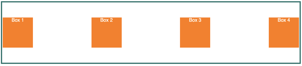
align-items: center; // aligns items at the center of the container
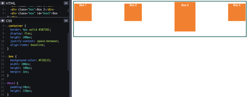
align-items: baseline; // all the baselines (like text lines) of the items will be aligned with each other (especially good if your items have different heights
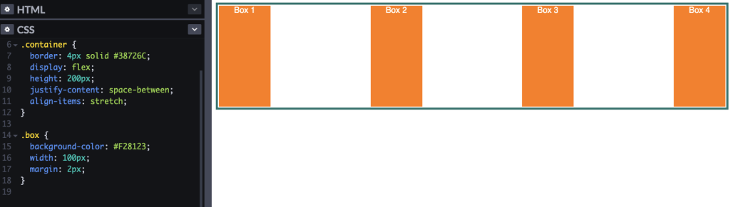
align-items: stretch; // the items will stretch from the top to the bottom if they can, unless they have their own height specified which doesn’t allow them to stretch all the way (this is the default).
To illustrate better how all of these look, I’ve made the container a bit higher. I’m also keeping the items spread out horizontally with justify-content: space-between;
Our starting container code now looks like this:
.container {
border: 4px solid #38726C;
display: flex;
height: 200px;
justify-content: space-between;
}
align-items: flex-start;
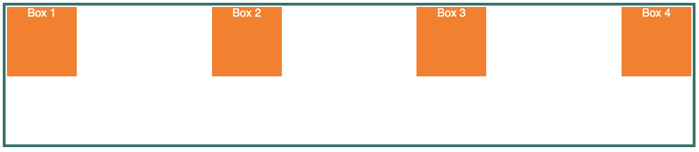
align-items: flex-end;
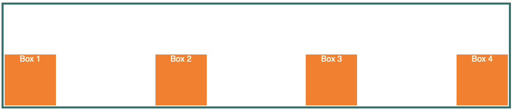
align-items: center;
align-items: baseline;
align-items: stretch;
Wrapping items around multiple lines with flex-wrap
So the above works really well if we have one line of items that need to be positioned along the width of the container and where we want to set some vertical alignment. But what if we had not 4 but 10 or 20 boxes in the same container?
We’ll need to wrap the items over multiple lines with flex-wrap and we can do that in multiple different ways:
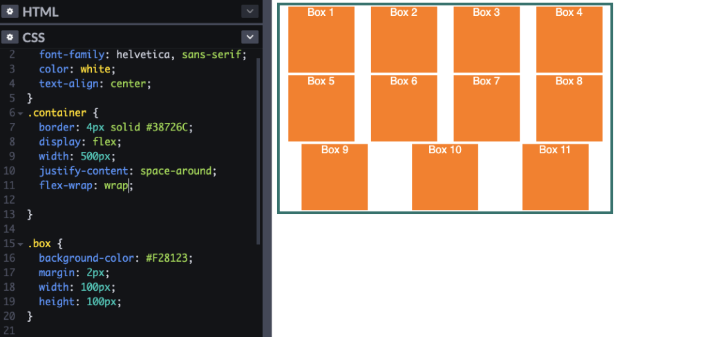
flex-wrap: wrap; // will fill the line with as many items as possible and then move to the next line
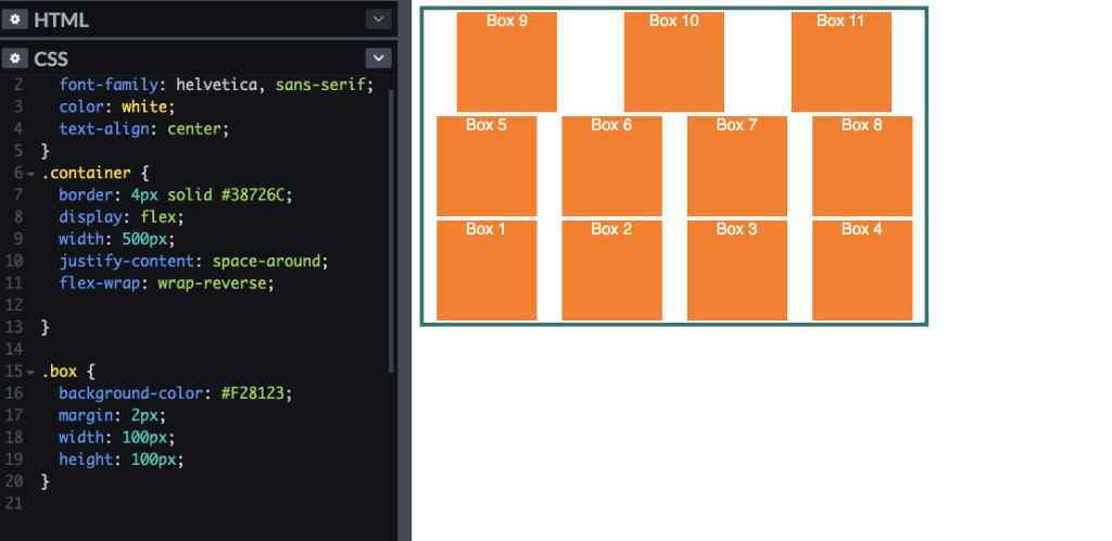
flex-wrap: wrap-reverse; // wraps in the same way as above, but the order of rows is reversed. So the first items will be in the last row
flex-wrap: nowrap; // this is what it does by default
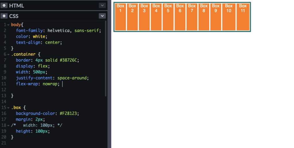
flex-wrap: nowrap ;
I added some more boxes to our container, but removed their fixed width. The no-wrap will therefore space them all out equally throughout the container as we asked it to do with justify-content: space-around.
flex-wrap: wrap;
To illustrate the wrapping, I’ve fixed the width of the container and the boxes so that not all boxes will fit into one line. With flex-wrap: wrap; we now have the items in their set width spread out over multiple lines:
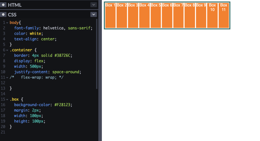
Important! If we don’t set the flex wrap, then the width of the container will overwrite the width of the boxes, meaning all the boxes will be squished into one line and lose their 100px width even though we set it:
flex-wrap: wrap-reverse;
Creating rows and columns with flex-direction
For now, we’ve only kept our items going from left to right. But maybe we want to have columns instead of rows or have things in reverse order or some such fancy business. We can do this with flex-direction in the following ways.
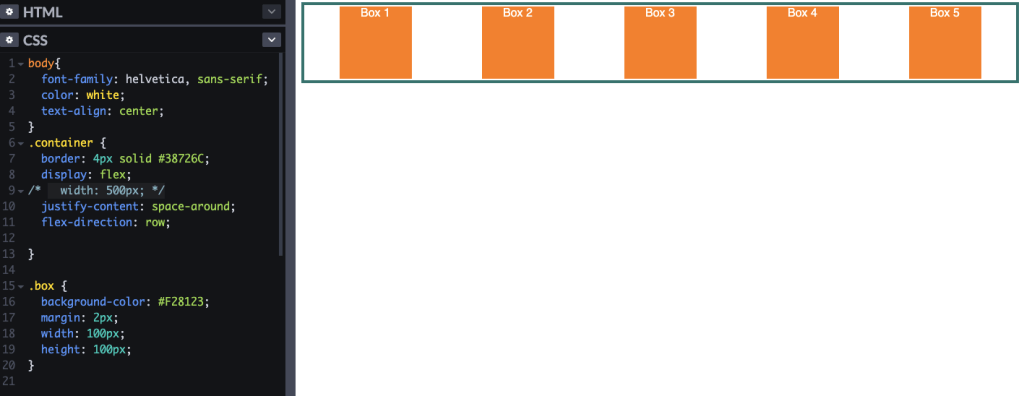
flex-direction: row; // does rows like in all the examples above (this is the default)
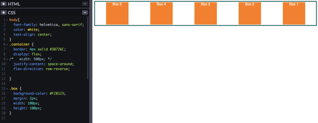
flex-direction: row-reverse; // creates rows with items in reverse order, so first item on the right
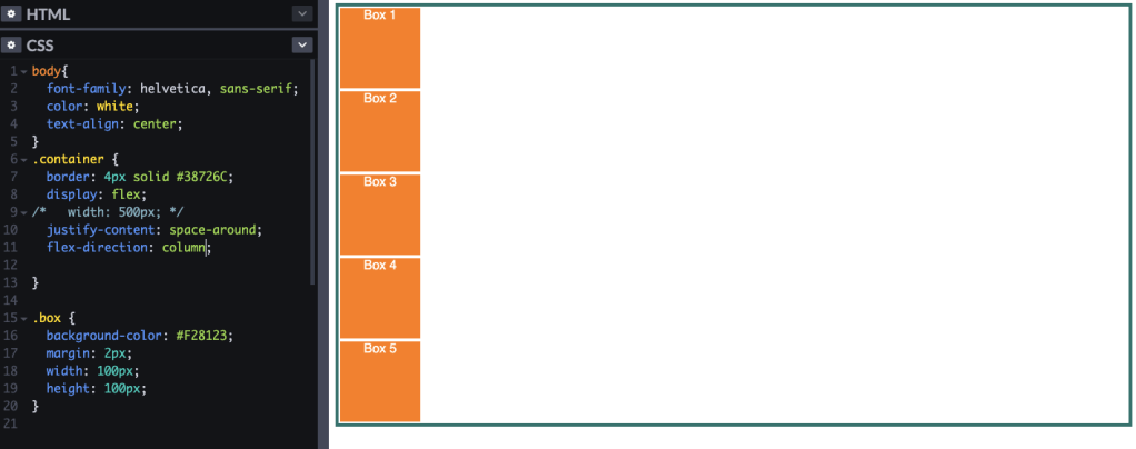
flex-direction: column; // aligns the items top to bottom in a column;
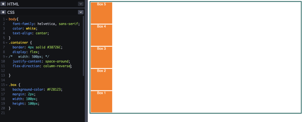
flex-direction: column-reverse; // aligns the items in a column in reverse order
Here it is in action.
flex-direction: row;
flex-direction: row-reverse;
flex-direction: column;
flex-direction: column-reverse;
Doing it more efficiently with flex-flow
Instead of writing it out over two lines – because seriously, who has time for that? – we can combine flex-wrap and flex-direction into one property using flex-flow, which goes like this:
flex-flow: [direction] [wrap] ;
So the following container:
.container {
display: flex;
justify-content: space-around;
flex-wrap: wrap;
flex-direction: column-reverse;
}
can be rewritten as:
.container {
display: flex;
justify-content: space-around;
flex-flow: column-reverse wrap;
}
And this concludes our overview of positioning shit on a page with flexbox. For practice, I think I’ll go create a weekly planner, or a lunch menu, or an image gallery. Endless opportunities!
Once I’ve mastered that, I’ll go on to resizing things for different screens with flex-grow and flex-shrink. Bring it on. 🤟


